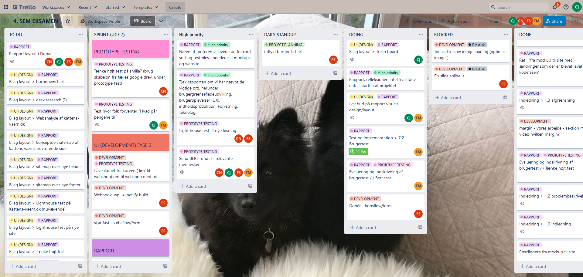
The Process
In this project we had to find a company that wanted a complex
website. We used "design thinking" as a process method which
meant we worked in iterations through the different phases of
the project.
To manage and keep track of the different tasks in our project,
we held daily SCRUM meetings and used Trello as SCRUM board.
Throughout the project we used a burndown chart to track our
progress.
During our research phase we tested and analyzed the existing
site with tools such as BMC, SWOT/TOWS, surveys etc. to help
identify Kattens Værn's problems. This gave us the right
insights to be able to initiate the ideate phase and develop new
solutions. Every iteration was based on results from user tests
and research.
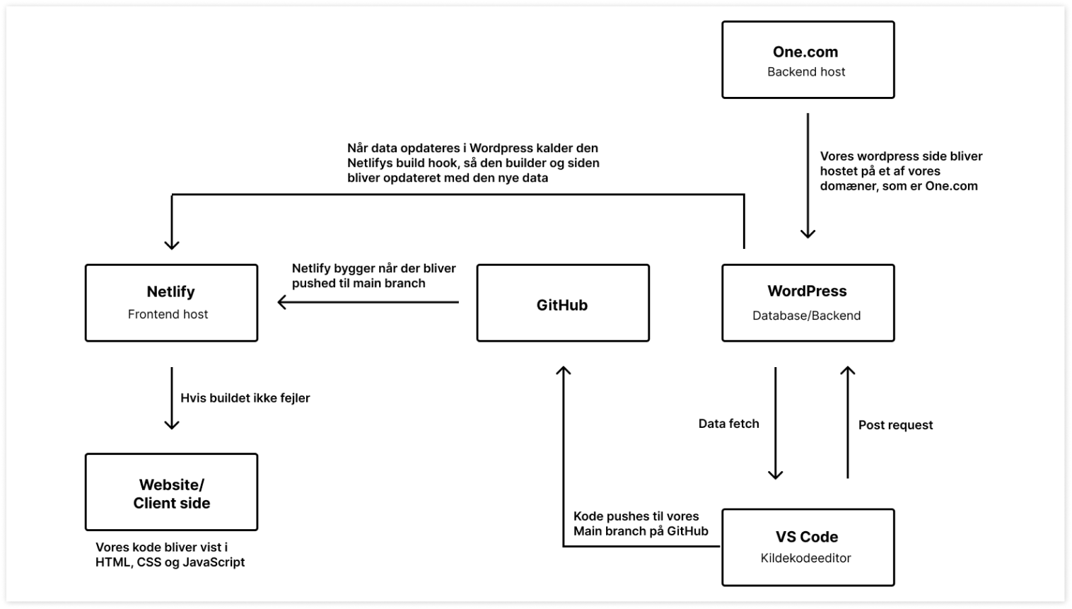
Code
The website was built using WordPress as our backend/database.
To be able to add an article to a listview e.g. a cat to a list
of cats ready for adoption, we used posts and the plugin "custom
fields".
The frontend was built with Next.js which made it possible to
fetch data from WordPress using getStaticProps which is more
sustainable compared to other methods. Since the website was
very complex we used Chakra UI as a component and theme tool.
This way we could easily implement components such as dropdowns
and accordians with a consistent design.
Netlify was used as frontend host. Since we were multiple people
coding on this project, we made git branches and pushed to the
main branch. This would trigger Netlify to build and update the
changes to the website/client side. Since we used static site
generation, which means HTML is generated on build time, netlify
would only opdate changes this way. Since we wanted employees of
Kattens Værn to be able to potentially add cats themselves
through WordPress, we added the plugin "WP Webhooks" which
triggers netlifly to build everytime there is changes to
WordPress data.
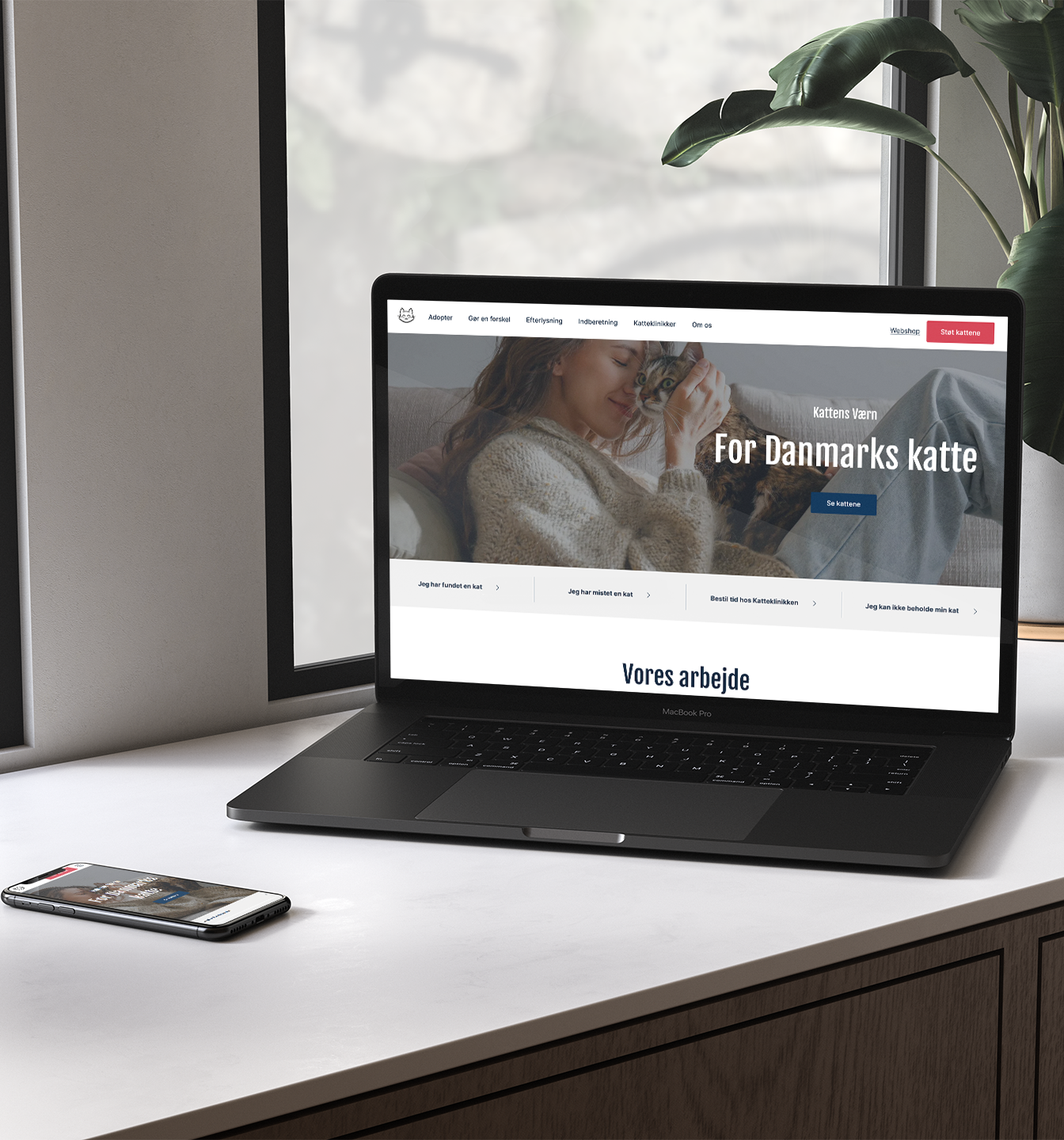
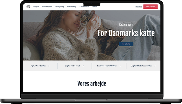
Design
After our research phase we concluded that the website consisted
of an overwhelmingly amount of information. The navigation
itself was very confusing with "hidden pages" and labels that
didn't always make sense to the target group. The layout of the
website wasn't consistent and did not comply with the
conventions which gave an messy and unprofessional vibe. Our
main focus was to simplfy the IA and modernize the website with
a new visual ID.
Since this website would consist of many different colorful
images, the colorpalette was made in neutral colors that didn't
take attention away from the most important part - the cats. To
highlight important options such as donation we used a warm pink
as a secondary color. To catch the eye of the user we created a
contrast with a cold blue as well.
We also designed a new version of their exisiting logo, which
worked better on digital screens.
When asking the target group what was most important when
deciding to donate to an organization, one of the most important
things was transparency. To bring out more of the feel of
Kattens Værn and get a look "behind the scenes" we filmed and
edited video content which introduces the organization and gives
an insight to their work.